The Story of a Brand Logo: Starbucks
What does branding do for the image of a company? What is its purpose? Well, it is the fastest and most immediate way of getting a message across.
You know the old saying. A picture is worth a thousand words. That's what a brand logo can be, at least hypothetically. But a bit of curiosity never hurt anyone, apart from the cat. It can also tell us about psychology, marketing, and how complex or straightforward branding can be.
Take, for example, Starbucks, the largest coffeehouse company in the world. Its logo is a mermaid, a siren, or a Melusine, depending on where you come from. Coffee and mermaids? A siren enjoying a nice, hot cup of Joe on a breezy morning while waiting for the daily 'catch' of sailors to arrive? Black humor aside, why did Starbucks pick that logo?
Why is the Siren on Starbucks' logo?
The first hint we get about the logo is the company's name. Initially, it was about to be called Pequod, but in the end, it was called Starbucks. Both names, however, come from Herman Melville's 'Moby Dick' - Pequod is Captain Ahab's ship, and Starbuck is the coffee-drinking chief mate on board. That gives us a bit of context. Apparently, Starbucks saw itself somehow connected to the sea and thus chose that logo for itself. Why the sea? Well, back in 1971, when Starbucks was beginning to see the light of day, Seattle -- its hometown -- was still known for its seaports, sailing, and the overall close ties between city and sea. The connection between coffee and the sea is deepened because coffee came from overseas even further back in history.
So far, so good, but why pick a mermaid, and what's the symbolism behind that? While researching, some online sarcastic comments suggested that the company's logo stands for 'obsession, addiction, and death." By far not the most eloquent way to put it, I must admit -- and somewhat far-fetched at that, too. True, mythologically, mermaids and sirens stood for the certain death of seafarers as they sang their beautiful and irresistible songs and lured them with their ships towards dangerous cliffs.
On the one hand, the logo may represent the idea that Starbucks coffee is supposed to be irresistible. Starbucks is the world's largest coffeehouse company, so that doesn't seem far from the truth. On the other hand, the second part of the siren story doesn't fit well. Unless, as the sarcastic posts suggested, the point was to seduce people into buying endless cups of overpriced coffee and spend the rest of their lives on the tiny tables at Starbucks locations.
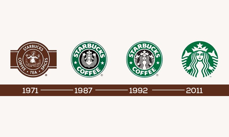
On a lighter and more innocent note, Starbucks itself explains the choice of the mermaid as an affinity with its mysterious and nautical nature. A storyteller and a singer, the Siren is their way of creating their company story and image, remembering their heritage, and engaging with clients creatively. True, she's undergone several redesigns over the years, from the initial 16th-century Norse woodcut where she was still bare-breasted and with an exposed nipple, to what you see today. Some conservative and overly religious markets still don't accept her, which might be why the redesigns over the years make her 'politically correct.' For that reason, Starbucks has also been criticized for succumbing to a 'visual identity system' instead of retaining some of the more raw and primal force the mermaid carries.
Although the above was not a thousand words, Starbucks' logo still tells an interesting story. And there's a lot more to it. However, that would require in-depth research into mythology, religion, and the history of Western civilization and society. Who knew a brand logo could be so complex? I suspect that even the founders did not realize how deep they were going when they picked that image.
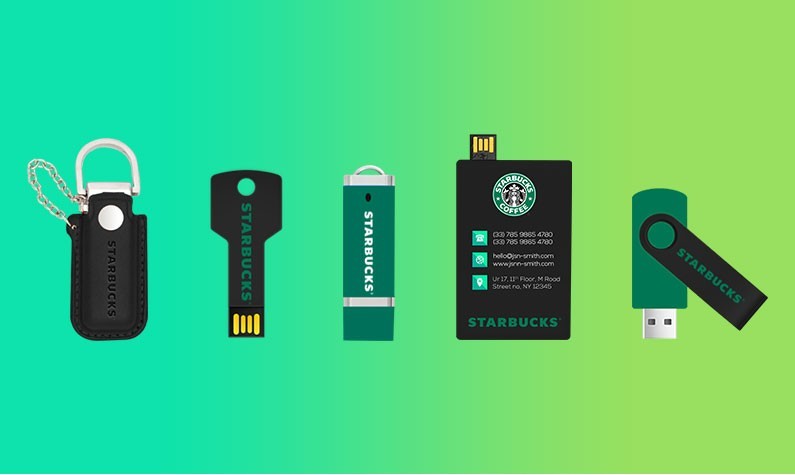
Whatever your brand and its logo are known for, how do you promote it to your customers? If you have an iconic logo like this one, consider our flash drives by industry. These custom products can be made in the shape of your logo, mascot, or even the Starbucks siren.


